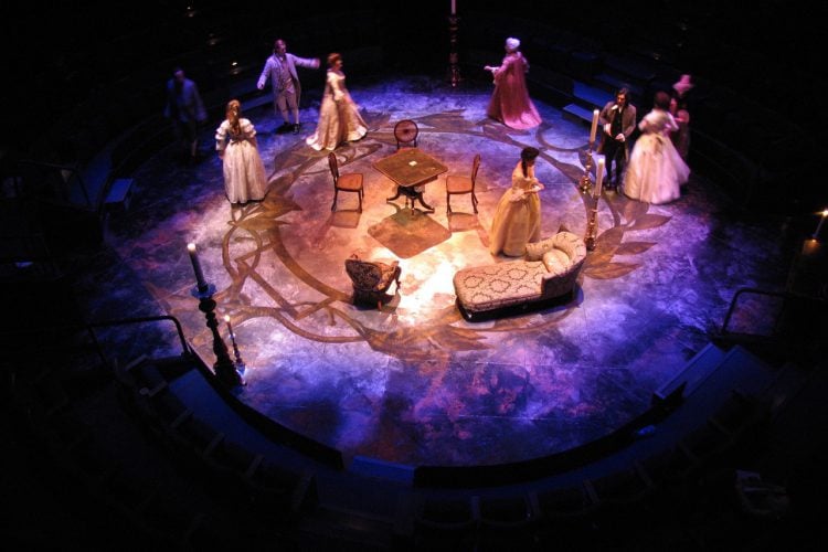
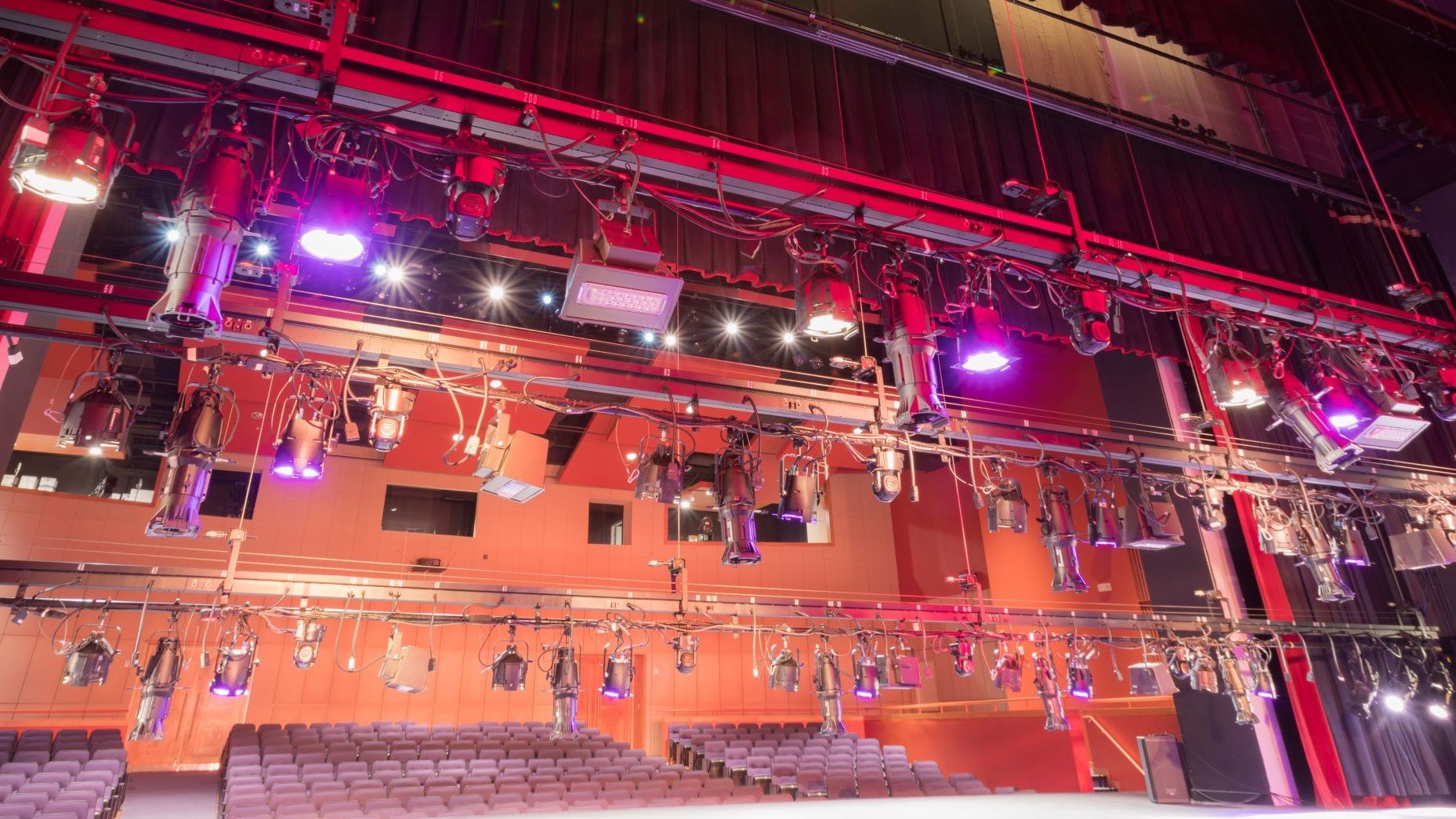
Lighting designer Daniella Beatie discusses the world of lighting design for theatre-in-the-round in this latest blog article. She is based at the New Vic Theatre Stoke-on-Trent and has worked on over 100 productions in-the-round including, Prince and the Pauper, Much Ado About Nothing, The Wind in the Willows, The Witch and the Wardrobe, and much more.
Designing for theatre-in-the-round starts the same way as it would with any design: with the story. Our decisions are going to be based, stylistically speaking, on the ideas we want to communicate and the design language we use.
Working closely with the director and designer will help answer some critical details early in the process. For example, does the action take place in a single location, or in multiple locations? How much of the stage will the actors inhabit? In theatre-in-the-round, the lines of demarcation between the actors and the audience are less defined. Entrances, called “voms” (from the Latin, ‘vomitoria’), and staircases often become part of the acting space, which means that the audience members sitting nearest to these are very much in the action. In a format where large sets and scenery are practically non-existent, you tend to rely more heavily on the lighting and sound designs for the communication of narrative intent.
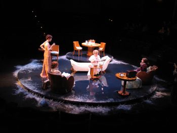
Generally in theatre-in-the-round, all seats are raked towards the stage, so the floor covering becomes your constant companion. A painted floor with a matte finish has a great depth to it, brought about by the scenic artist’s layers of paint. For example, when painted with gold, it will usually have a red undercoat, so it will be much more reactive to the warmer tones in the lighting. The same gold color printed on vinyl floor is made of pigment ink and only one layer thick so it can appear thin and not as lush. This is particularly accentuated in-the round, because as the light hits the stage the resulting angle of reflection for the viewer opposite can change the perceived color, or in some cases, the shine of the reflected light can obliterate the floor in the shine-spot. It is worth asking about the floor texture and finish, if it is painted, will it have a glaze? A matte or satin sheen is very different to a high gloss.
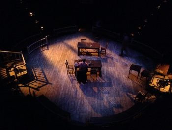
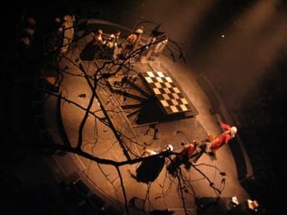
The image below was from “Dangerous Corner” which featured a high-shine dance floor; I absolutely did not want any lantern reflections to be seen from any seat, as that would break the illusion, so the angles for every lantern were particularly important.
Lighting-in-the-round is not as simple as doing the same thing from four sides; this very quickly becomes flat and uninteresting. It is better to think of the space as a three-dimensional sculpture; one person’s window key-light is another person’s backlight. The design is about creating a world that explores all the permutations of light and shadow, color, shape, and form. While it can be very dramatic to light an actor from their facing side and leave the rest in darkness, it can lead the audience members who are sitting behind them to disconnect from the actor. It can also be tricky as the actor is trying to take in and engage the entire audience during the speech. They will turn their head through 180 degrees, so their face light becomes side light.
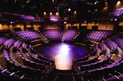
Not all theatres-in-the-round are the same, as they are uniquely affected by the building infrastructure. They will take on some of the idiosyncrasies of their parent building.
To use the beverage analogy, the SJT Scarborough is an espresso cup, with one height grid and steep-sided auditorium. New Vic Stoke is a big fat teacup, double height, rig wider shallower-sided auditorium. Manchester Royal Exchange a latte mug, treble height and a very steep-sided auditorium.
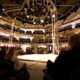
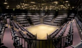
Starting to design
When starting a design, I would still look to key-light as the first aspect to embrace. Whether creating a realistic external scene or one void of defined space, it helps to assert our sense of direction. Our perception of three dimensions as a human comes from the assessment of perspective through the quality of shadow and light. Representing three-dimensionality in-the-round can be done with multiple techniques.
Intensity: Using key-light from one direction, with an accompanying fill-light, from two or three other directions with differing intensities, gives the eye a variance and that is how we perceive depth and dimension.
Depending on the amount of reflected light that will be coming from the floor below, and the distance of the direct light from your lantern to the subject, you can achieve a great deal by playing with the levels, even if there is just a slight variance in each lantern.
Angle: Being in-the-round, the choice of lighting angle is not just of left and right. There is an added vertical component to consider too, although this does depend on the venue where multiple heights are available.
If you hold your hand in a horizontal plane in an average room, most light is coming from above, however, if you are looking at the underside of your hand it is relatively well lit by natural bounce of the light in a room. As we don’t have walls in-the-round to help us bounce the light around, if we put one single light source from above and put our hand up again, we have a void of light underneath. This can look quite unnatural, so we have to work with reflected light on the floor and fill light from different angles to achieve this.
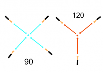
In the horizontal plane, there is a debate here on the merit of the 120° versus the 90° placement of lanterns when making a system (a ‘system’ being the group of lanterns chosen to light a particular area on stage). This means that when standing in a position on stage you would have a lantern focused on you every 90 or 120 degrees. I would always choose the 90° (four lanterns) option, as it blends all the gaps together. The other option, 120° (three lanterns), does cover but it can cause things to look a bit fragmented. This option may be unavoidable when you run out of equipment, as can often happen. Working in-the-round is a lantern-hungry format.
Form: In our world of artificial light we are often in pursuit of the perfect flat even light, however, this can make an object look false. When we look around us in everyday life, this is very rarely the experience. The introduction of texture and randomness can be a very useful sculptural tool. Being in control of the randomness is the key to the art. As mentioned earlier, the action on stage is often very close to the audience. Keeping the spill- and bounce-light off them is an eternal battle. You do have to accept that they are in the sightline and will be seen. Careful choice of lantern and precise focusing will help direct the audience’s attention and minimize the spill.
One of the questions I am asked most is: “Can you use dance-style side light or booms?” In the traditional sense that would be “no.” In the round world model, there is no side / front or back-light, just the omnipresence of light, the very nature of theatre-in-the-round, one person’s side light is the next person’s front light. However, as with all things in-the-round, you must look at things from a different perspective. Using a light from a low position can cast shadow in such a way that the spill can be masked in an opposite staircase or vom, that can allow the actor to be sculpturally lit from the side in a specific place on the stage.
Color: Color is one of the most useful tools for molding your space. The palette may call for something radical, or something more subtle. You can pick a main color for your key, and then pick a color that is a semitone or shade different for the fill lights. Having multiple sources in slightly different colors results in a more believable look. Usually, theatres-in-the-round have easy access to the grid areas, so experimenting with a change of color can easily bring huge rewards. The prevalence of LED lighting is making this choice and process arguably easier.
In any theatre-in-the-round, you will never have a flat experience. Everything you look at is on a curvature, from every seat your visual outlook will differ. From seat to seat. there is an angle change akin to the auditorium, so the relationship to the stage and the light changes slightly from your neighbor, and radically from a person 90 degrees to your left, and from the person exactly opposite you. It also means you have to keep moving in the tech and dress period as you effectively have a different show to light on each side. Balancing the look from one side to the next is a unique challenge of in-the-round. Using light to manipulate and enrich the audience experience is where the creative joy of designing for this genre lies.
It is rare that you get to stand in the middle of the stage, point in any direction and say: “I would like the light to come from there please”, and you can have it. Theatre-in-the-round is a very liberating space to work from as long as you embrace the differences it makes
Daniella Beattie


