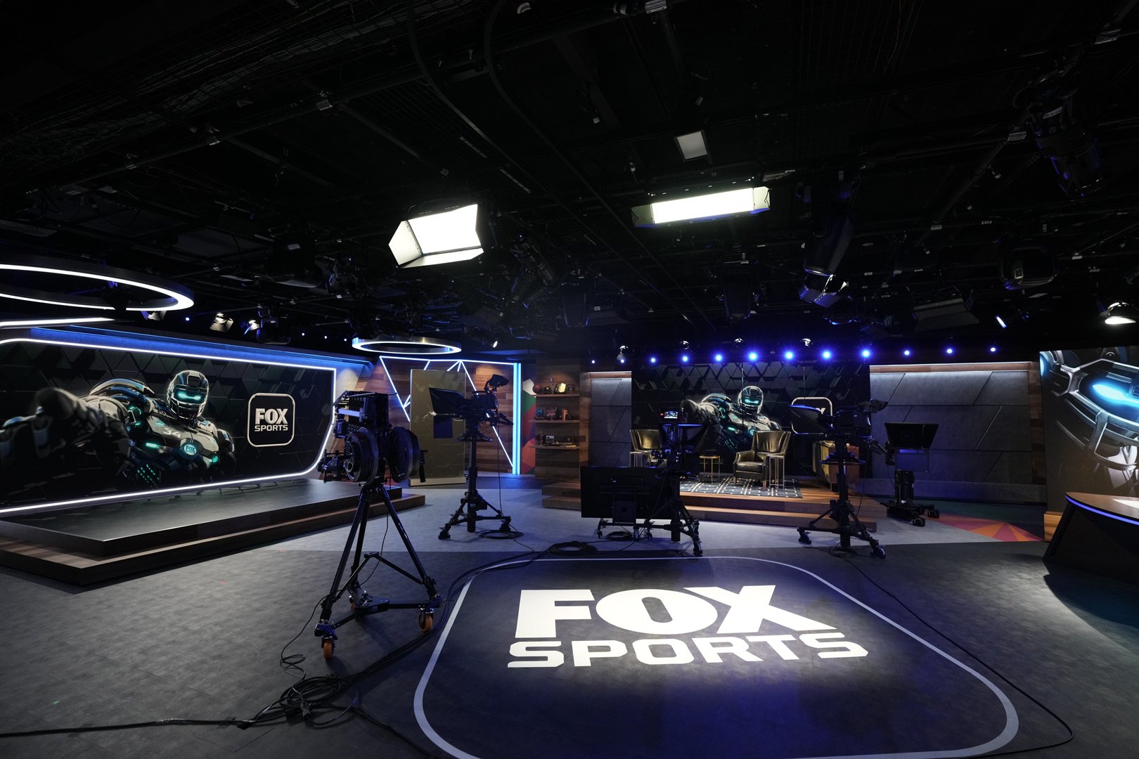
There is no off-season for sports coverage, just a constant competition to be the best. So when FOX Sports built a new, digital-first studio, packed with movable LED scenic elements, they needed lighting and lighting controls up to the challenge of making good-looking lighting no matter where the talent ended up. Naturally, they chose ETC. Working with Los Angeles-based dealer Kinetic Lighting and Laura Green, the Director of Kinetic’s System Sales & Installation Department, ETC provided fos/4 Panels, High End Systems Halcyon Gold automated luminaires, plus Source Four LED Series 2 and Desire LED Fresnels, all controlled by an Ion Xe console.
Kinetic Lighting is an award-winning lighting company based in Los Angeles that provides theatrical and studio lighting services to clients throughout the U.S. in studio, corporate, exhibit, theatre, and live-event markets. While they remain focused on lighting, their range of services is diverse and includes equipment rentals, sales, lighting design, pre-viz, and related show services. Kinetic’s System Sales & Installation services include project management, design and specification, installation, programming and commissioning.
The studio opened in June 2023 to rave reviews and great-looking content. Lighting Designer Scot Gianelli, with Kinetic Lighting, spoke to ETC about designing the space, the installation process, and why ETC was such a key player.
ETC: This is a new studio, but not a new building. What was the scope of the renovation?
Scot Gianelli: This project was a total gut retrofit of the lighting and scenery from an existing studio space. Everything but the venue walls and dimmer racks were brand new. (The dimmer racks were already by ETC.) The biggest goals for this project were to provide as much flexibility as possible while staying within a pretty rigid budget. Unlike a traditional newsroom-style studio, this studio was designed by FOX’s team to accommodate three very different stages and two smaller satellite sets. Each of these were designed to be used to satisfy a wide variety of different content for different mobile-first formats (TikTok, Instagram Stories, the FOX Sports app, etc.) Each of the three main sets utilized different configurations of physically moving and static LED walls that could be re-arranged to make different for new shows and formats as they are developed. The lighting design had to be prepared to accommodate any idea they were prepared to throw at each stage, while also making sure each setup still looked clean, thoughtfully designed, and intentional. It was also important for us to design something as future-proof as possible. This design needed to continue to satisfy the needs of an evolving slate of shows, IPs, brand colors, etc, while putting little to no strain on the in-house team to not only maintain that system but make those changes over time as the programming in the studio changed.
Did you know all this heading into the design or was it a process of discovery?
I think every project and show is really a process of discovery. I try to be extremely conscious about not going in and just imprinting every project with "my look" or aesthetic, especially on permanent installs. I tend to take a bit of a step back in the initial phases of a project and really understand what the client team is looking for, what the space, scenery, budget, and programming mandatories are, and then approach the design in a way that satisfies all of those things in the most tasteful, beautiful way possible. Some projects want to be flashy and exciting while others want to be extremely crisp and clean without the design drawing attention to itself. In this case, though, we found in discovery that the design wanted to achieve a bit of both of those things – flashy and exciting plus crisp and clean! As this project started developing past initial conceptual talks, it became clear that the programming in the space wanted to look more clean, professional, and dressed up than it had been in its previous life, something more broadcast friendly and in keeping with the visual standards of FOX Sports. but that the programming was ultimately still part of their digital content output, and mostly for streaming and webcast. With that, they wanted to maintain a little more visual flair and edginess than something more traditionally “Prime Time.” By staying loose and adaptable, we were able to let the needs of the programming direct the design choices and came to something that feels like a newsroom meets a really vibey podcast loft.
What was the install process like?
The install process was pretty straightforward as it was a gut renovation. We got to have a lot of say in dictating things like pipe grid placement and had the chance to advocate for things that are normally non-negotiable on projects that are more of a retrofit, or in cases where more of the original venue and scenery are left. It's also important to note that by using a nearly entirely ETC ecosystem (Eos family console, Paradigm for architectural control, and ETC fixtures), there's just a native ease to everything, as opposed to trying to get multiple systems communicating properly. It always just sort of fits together better when everything is in the same family. Having consistent fixture menus and modes also makes the workflow really consistent for the technicians installing the rig and helps minimize errors, confusion, and troubleshooting.


Why did they choose the fos/4 Panel? What did they like about them?
I had shot these fixtures out a few times and seen the way in which they went toe-to-toe (and frankly, excelled beyond) the traditionally premium grade panel fixtures typically associated with studio lighting, and was dying to use them on something permanent. For this project, the biggest challenge for me was how low the grid was. Our pipes were only 11-12 feet off the ground with big 10-foot LED walls behind every set. So the most important factor when I started picking fixtures was size and finding the most compact solutions available. In addition to being incredibly bright and having terrific and consistent color rendition, the small fos/4 Panel is simply more compact than other fixtures in its class. And it's black and blends in nicely with the grid! This was also important because with every fixture competing to be small, I had real concerns with larger panel and mover fixtures causing issues with shadows. In many cases, even another inch or two on the fixture size would have created a problem. We managed to avoid that with this fixture.
 Fresnels are making a comeback! What did ETC Desire Fresnels give them in their design?
This is a bit of my theatre background showing, but I have always loved Fresnels, especially as backlight. They have such a beautifully soft, halo like quality to them and they just shape better with barndoors than LED PARs do. I also like that they are much better about not seeing shutter/barndoor edges on decks and walls than other fixture types (without using a ton of diffusion). And overall, Fresnels create a much smoother, cleaner look on the show floor with softer, less distracting shadows. This is also sort of silly, but even in little podcast studios, I'm always thinking about what the wide shot looks like and there's just something about Fresnels with barndoors that feels so classically "news studio" that it almost feels scenically like the right choice, in addition to be right for the lighting design.
Ion Xe – small but mighty! Why was this console the right choice for this studio?
Much like the fixture design process, the control design process was initially guided simply by footprint requirements. The overall studio is actually quite small considering it has nearly five unique shooting locations in it. On top of that, the control space is small and didn't have the space to accommodate a lighting desk. So we were tasked with providing a robust, fast, flexible control surface that had to live in its entirety on a small Innovativ cart in the room and be as discrete and out of the way as possible. One of the things I really love about the ETC family of consoles is that nearly all are extremely similar on a software and processing power level, which makes scaling down into a more compact footprint an easy no-brainer since almost nothing on the control side needs to be sacrificed. Importantly, too, it also gives us the opportunity to provide projects with more restrictive budgets with really great, visible value when we can show high-impact savings without high-impact compromises on the control system. Lastly, we knew that once this space was installed and the initial looks and programming were complete, it would fall on the venue team to maintain and ultimately adapt and modify the cues and content on their own without having a really robust lighting technician on their team. The Eos software is a first choice for me when I need to set up a console for this kind of team. The highly visual, clear, user-friendly magic sheets allow me to make layouts for these teams that make it a super intuitive breeze for them to easily manipulate the rig on their own, store new data, and feel confident that they are in control of their process. I'm a big believer in not getting service calls! It's really important to me that when I leave a space, the client really feels empowered to take over the rig confidently and the ETC software makes it a breeze to do that.
Anything else unique about the setup?
Because the space needs to be so flexible (to the degree that they even changed their main show and host during load-in), there are eight High End Systems’ Halcyon Gold fixtures distributed around the space with no design intention at all other than as future-proof fixtures and “get out of jail free” cards. This client team understood early on that finding the budget to have a few backpocket fixtures to call on when things change was critical. Our answer to this was to essentially make a circle of Halcyon Gold fixtures in the middle of the room so that every set had a center, 45° left and 45° right moving head that could dig in at a nice angle almost anywhere you would reasonably throw a new segment or new talent. Much like the small fos/4 Panel, we chose the Halcyon Gold because it is compact, impressively quiet, and delivers an incredible output with a low-draw LED engine. In the cases where we used them as key lights, I don't think we ever needed to run them above 8% to get great, clean camera shots.
How happy are they with everything?
We had always talked about how dynamic a fully color changing LED rig could be, but it's always such a blast when a client sees what that really means. The previous iteration of this studio had really been driven by lighting with color temperature control exclusively, and to take that to the next level and create a space where each stage could have so many drastically different personalities in the design based on the day-to-day programming was a real treat for them, and a thrill for us to be a part of.


.jpg)

