In part one of An Array of Choices, we looked at red, green, and indigo LEDs. In Part 2, we explored additional LED colors.
In this third part, we’ll discuss individual emitter colors with mint and then transition to white light.
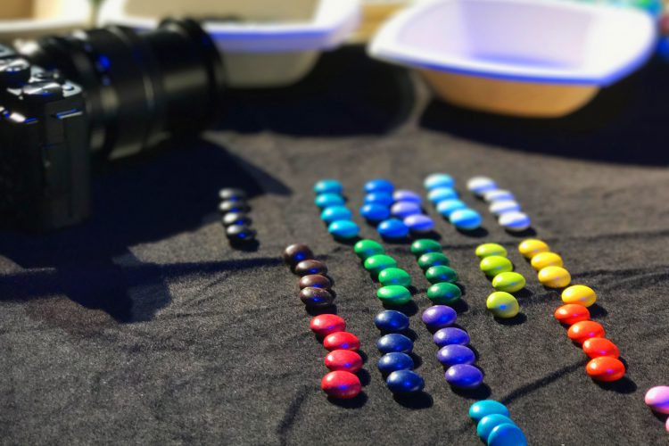
Mint LEDs
Wrapping up our color exploration, mint is a broadband emitter (similar to lime) that can easily pull saturated cooler colors into more pastel tones. It is commonly deployed in arrays used for mixing to white. 
The technical bit: Mint’s phosphor-converted broadband spectrum is really well suited to helping “tune” whites to desired CCTs (Correlated Color Temperatures) in the 1900 – 10000 K range. Using it in a complex color array like ETC’s Daylight HDR allows far more control over the subtleties of the color mix versus a simpler array like RGBW or RGBM. For example, users of complex arrays can easily adjust for a green/magenta shift, which is particularly useful for camera work.
The arty bit: The only broadband emitter in an RGBW mix is white. In RGBM, the only broadband is mint. In a more complex array, such as the Daylight HDR mix, the cyan, blue, and mint emitters are broad. The result is a fuller-spectrum light source at any color temperature.
There is nothing wrong with lights that use one combination of emitters over another. The key lies in understanding the differences in how one vs. another will make things look and what options each has if something needs to be adjusted in the moment.
The Many Colors of White
Color temperature is a technical term that describes the ‘color’ of a nominally white light source. Why is color temperature important? We experience changes in color temperature throughout the day, such as warm amber sunrises and sunsets, neutral or cool white afternoons, and cold blue twilights. Color temperature (like many attributes) can help us set the mood for a cozy restaurant or lively lobby. 
Rather than using non-specific descriptors like warm, neutral, or cool in specifications, though, using color temperature measurements keeps specifications... well… specific – also repeatable and matchable* (yep, that’s an asterisk to be explained shortly). Designers often need to match multiple white light sources in an installation, and specifying color temperature is one common way to create consistency.

A quick review of color temperature before we explain that asterisk above: think of a steel rod in a furnace. As it heats up, it starts to change color - first red, then orange, to yellow, then white, and then blue. This same principle is applied to color temperature, except instead of a steel rod, we use a ‘theoretical blackbody radiator.’ It would not be physically possible to heat an object to infinity, so the theoretical model plus the wonders of math give us our standardized reference scale. As the blackbody is heating up, the electromagnetic energy it radiates is directly linked to its changing temperature. That temperature is expressed in kelvin (K), an absolute thermodynamic temperature scale. The corresponding chromaticities are plotted on a graph forming the blackbody locus or Planckian curve.
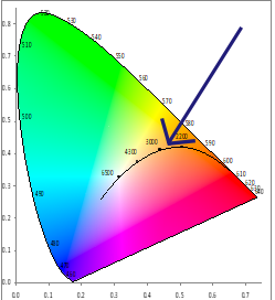
Blackbody curve shown on CIE 1931 Chromaticity Diagram
Now about that asterisk: fixed white light sources, like a white LED emitter, typically are not actually a chromaticity that plots on that curve. There are deviations in the spectral content of different whites that mean they are typically above or below it. Even daylight plots above it! So what is that kelvin value listed on a spec sheet? It’s usually a nominal CCT, which stands for Correlated Color Temperature.
The “nominal” part is akin to using "about" or this symbol ~. Take a 4100 K source, for example. A single given light source of that make/model might actually be 4126 K or 4052 K. A specifier should expect some differences due to manufacturing tolerances, but all ~4100 K. How big is the tolerance? That 100% depends on the manufacturer, make, and model.
If a light source does not plot exactly on the blackbody curve, a perpendicular line is drawn from the source’s chromaticity coordinates through the blackbody curve. Where they intersect is the correlated color temperature. The line with three stars on it in this diagram shows the correlated color temperature.
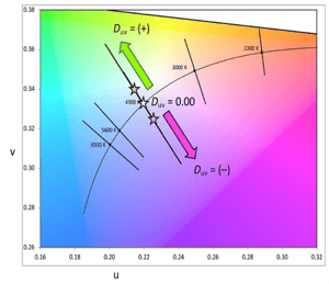 CIE 1960 Chromaticity Diagram showing CCT and Duv
Where a source plots precisely relative to that curve is expressed using Duv. A positive Duv indicates a shift above the curve towards yellow/green, and a negative Duv indicates a shift towards magenta. Just like CCT, a published Duv value typically has a manufacturing tolerance.
Readers who have washed gallery walls with Halogen MR-16s or tried to use open white on a rig of rented HMIs will be familiar with the jelly bean look – a mix of yellow, pink, green, and hopefully some neutral-looking whites. This colorful festival of differences can be mathematically quantified with CCT + Duv.
If a designer plans to install a slew of white lights to wash a white wall, it would be good practice to look at Duv values with CCT if possible because pink/green differences may be visually apparent. One 4100 K light might be a pinky white; the other might be a greenish white. If used in isolation, these differences may not matter, but if side by side washing that wall, they might.
In this example, light from a 4100 K source with a positive Duv will appear as neutral white when viewed by itself. 
Repeat that with a 4100 K source with a negative Duv, and it, too, will appear neutral white. 
When viewed together, however, the difference is apparent and may not be desirable. 
Small differences may not be apparent or meaningful, especially if they are both above or both below. This is a great example of something valuable, though extraordinarily difficult to mock up. Examples of existing installations may be easier to see for an indication of the luminaire-to-luminaire consistency a particular make/model might deliver.
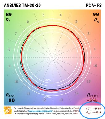
Fun fact: A TM-30 color rendition report (shown above) using an up-to-date template will show both the CCT and the Duv. It can be hard to find Duv reported elsewhere in a spec. If the CCT is a randomly specific value, like 4126, that’s a good indication that the manufacturer is reporting on actual measurements rather than theoretical ones.
TM-30 reports aren’t only useful for evaluating color!
This post is a part of a series. Check out the rest of the content at the links below.
Article written by Wendy Luedtke, and Declan Randall. Declan has been a freelance lighting, set, and projection designer for 23 years before he joined ETC as Training Program Coordinator in 2018. www.declanrandall.com