
In this series, we discuss some of the most frequently asked questions we receive about LEDs. Today, Color Technology Specialist Wendy Luedtke runs through chromaticity diagrams and what they mean in the world of LED fixtures.
Chromaticity diagrams are helpful tools to objectively specify the colors coming from a light source.
But first, what exactly is chromaticity? It’s a technical term to describe the “color” of a light source, independent of its intensity. Chromaticity essentially describes the point you are going for on a color picker. A chromaticity diagram is a scientific map to unequivocally specify exactly which chromaticity, or color point, is intended.
CIE 1931 Chromaticity Diagram
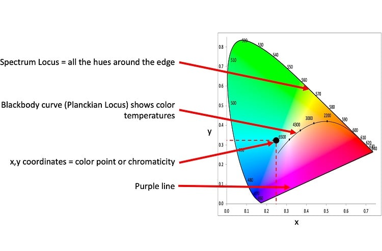
Perhaps the most well-known chromaticity diagram is the CIE 1931 Chromaticity Diagram. It’s plotted using x,y coordinates. The horse-shoe shaped border is created by plotting the chromaticity of each individual wavelength of the visible spectrum. Called the spectrum locus, this is where pure hues at full saturation are found.
The blackbody curve in the center of the diagram, formally referred to as the Planckian locus, shows where color temperatures are plotted. Color temperature describes white light, so that’s the generally white area of the diagram.
The line on the bottom is called the purple line and simply closes the diagram so all the colors don’t fall out. (Kidding! But really, it’s just a line.) Colors along the purple line can only be created through mixing. There are no purple wavelengths.
If this were a color picker on a control console, and the user touched a spot in the cool blue region, the x,y coordinates for that point on this diagram could be used to describe exactly what cool blue the user means. Two caveats: the colored background on any diagram like this is for visual orientation purposes only. The background should not be expected to exactly match the appearance of the color emitted by the light source. And, this is only describing the overall color. It is not describing how this color is achieved in terms of spectral content, or spectral power.
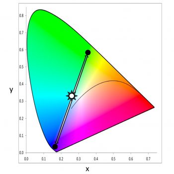
In the entertainment world, CIE 1931 is often used to show LED luminaire gamut and additive color mixing options. For example, if a luminaire has two colors, the chromaticities of each can be plotted and a line drawn between them. That luminaire can use those two colors to mix to any point along that line.
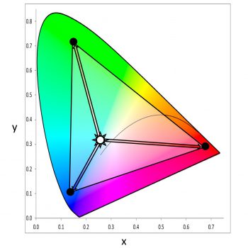
Plotting three chromaticity points, say for each of a three-color LED luminaire’s emitter colors, creates a triangle indicating the gamut of the luminaire. Inside the triangle are all the chromaticities mixable with those three colors. Chromaticities outside the triangle are not reachable with that luminaire.
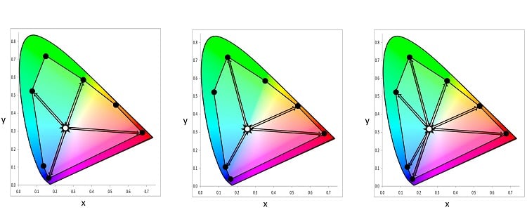
With four or more color points, all points within that polygon are reachable, some in multiple ways. Multiple “recipes” for the same chromaticity are called metamers. Different metamers may make the color of objects appear differently.
CIE 1960 Chromaticity Diagram
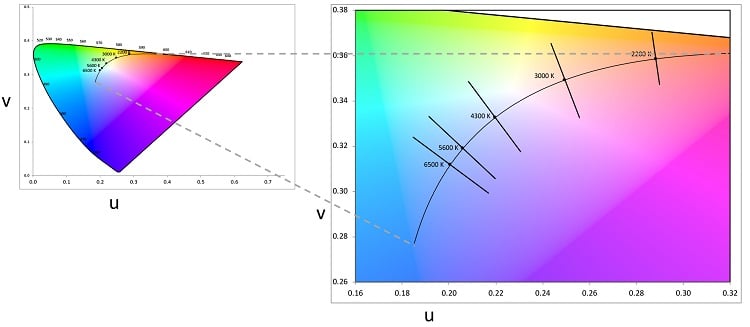
The CIE 1960 Chromaticity Diagram is technically the proper place to chart the blackbody curve. It uses u,v coordinates rather than 1931’s x,y. Correlated Color Temperature (CCT) is shown on this diagram. What is CCT? Many white light sources don’t plot directly ON the blackbody curve. They plot a little above or below. If a light source does not plot exactly on the blackbody curve, a perpendicular line is drawn from the source through the curve. Where it intersects is the correlated color temperature, abbreviated CCT.
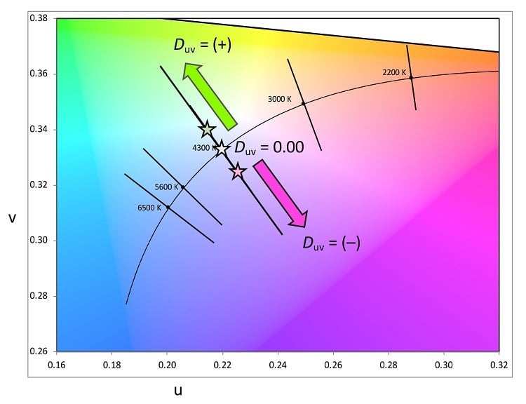
Duv shows how far away the light source is from the curve. A positive Duv plots above the blackbody curve, and negative Duv plots below. If positive, the source may appear slightly yellow or green; if negative, the source may appear pink or lavender. This information is critical in predicting the appearance of white, whether from a fixed white source or tunable/variable. See the image below for how a variable white might look greenish in some cases and pinkish in others.
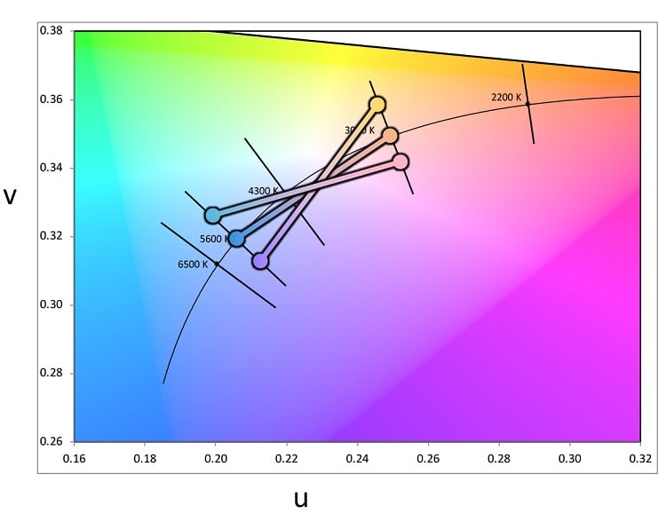
Here is a CCT of 4300 K with three different Duv values.
CIE 1976 Chromaticity Diagram
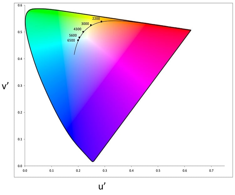
The CIE 1976 Chromaticity Diagram was created to make a more uniform chart for plotting chromaticity. It uses u’,v’ coordinates and is scaled so that distances in the diagram more closely align with perceived differences in color appearance.
For example, in the 1931 diagram, there are points where you can plot a relatively long line, but to your eye, the difference in color at each end of the line is barely noticeable. The 1976 diagram evens out those distances so a small perceived difference is a small distance and a large perceived difference is a larger distance.
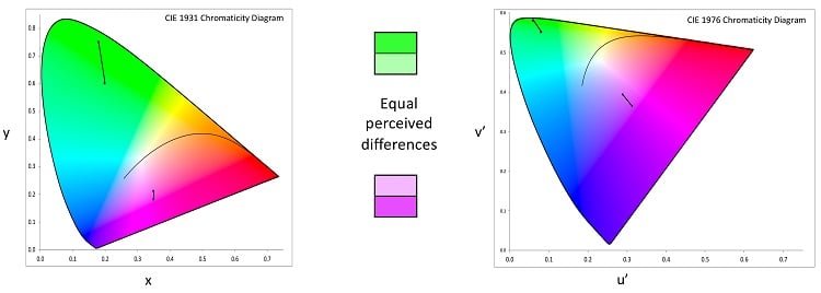
The 1976 diagram is preferred for showing color differences because the distance between points correlate more closely to the variations we perceive in color. Δu’v’ (pronounced “Delta u-prime, v-prime”) is used to specify differences between two chromaticities on this diagram.
In our next blog post of this series, we’ll continue the discussion on color measurements with an exploration of TM-30.